Turning a demo app into a sales weapon
Reimagined Mastercard's internal Sales Demo App for 2,000+ reps, reducing friction in the pitch flow and increasing close rates through smarter content surfacing and targeted UX research.
A powerful tool nobody knew how to use
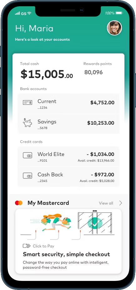
PartnerBank, Mastercard's internal sales demo app, had launched two years prior but wasn't being used effectively. Sales reps, marketers, and analysts had the tool but lacked the confidence and knowledge to leverage it in real pitches. As new Mastercard products launched, the gap widened. The challenge: how do you make a demo app a genuine sales weapon?
Research before pixels
I applied a four-stage research-first process, evaluating the current state before forming any hypotheses, then rigorously synthesising findings before jumping to solutions.
Step 01
Evaluation
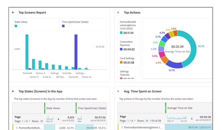
Understood the Sales Demo App (PartnerBank) purpose, analysed real-time Adobe Analytics data, and performed an independent heuristic evaluation to identify friction before talking to a single user.
Step 02
Identifying & Brainstorming
Used Mural to map observations from analytics using WHO / WHAT / WHERE / WHY / HOW frameworks. Drafted and iterated a survey through multiple versions before distribution.
Step 03
Research & Synthesis
Conducted interviews with global respondents, scripts customised per person based on their survey answers. Synthesised findings into problem statements, user personas, and a prioritised pain point list.
Step 04
Ideation
Designed solutions that addressed each pain point, from a four-phase educational workshop model to targeted feature copy changes that made the app's purpose immediately clear.
From survey to conversation
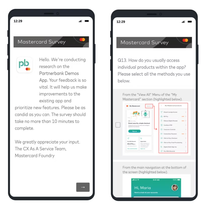
The survey was distributed to 11 global respondents. Each interview script was customized based on their individual survey answers, ensuring every conversation went deeper on the friction they personally experienced, rather than running through the same generic list.
Three pain points, three directions
After interviewing users across global regions, each conversation tailored to their individual survey responses, three clear pain points emerged.
Regional limitations
"Companies already having pre-existing technology beyond the sales demo app."
The app's utility was region-specific. Some clients already had more advanced systems, making the standard demo irrelevant without customisation.
Virtual work gap
"Would be useful if you're with someone face-to-face… I don't know how to share it virtually."
The app was designed for in-person demos. The shift to remote work created a fundamental use-case gap that wasn't addressed.
Confidence & knowledge gaps
"For it to be more helpful, I wish I could understand the product segments to present with customers."
Reps had the app but not enough product knowledge to demo confidently. The UI didn't compensate with enough guidance.
Three solutions, one for each pain point
Rather than jumping to a UI redesign, I designed solutions that addressed the root causes, including a solution that wasn't a product at all.
Addressing the confidence gap through a structured onboarding: Introduce → Educate → Perform → Evaluate. Reps would leave with the product knowledge and practice reps to demo confidently.
“Reset Demos” was confusing users, they didn't know what would happen if they tapped it. Proposed alternatives: “Refresh Demos”, “Reset to Original Demos”, “Clear demos”, each version tested for comprehension.
Regional usage, remote-first promotion, and app standardisation required longer-term investigation. Defined a structured research roadmap with methods (interviews, usability tests, surveys) and priority order.
Design solutions don't have to be digital
The biggest shift this project created in my thinking: not every problem is solved with a screen. The workshop model was a design solution, just not a product one. Entering Mastercard with limited corporate experience, I left with a deeper understanding of how research, communication, and transparent stakeholder relationships shape outcomes just as much as pixels do.