Killing the back-and-forth meeting dance
The goal was to create an app that lets people book meetings efficiently, without the complications and scheduling conflicts that bury everyone in email threads. A simple fix to a messy, familiar problem.
This narrative and structure follow the Timely project page I originally published on my prior portfolio site; here it is rebuilt to match my current case-study pattern.
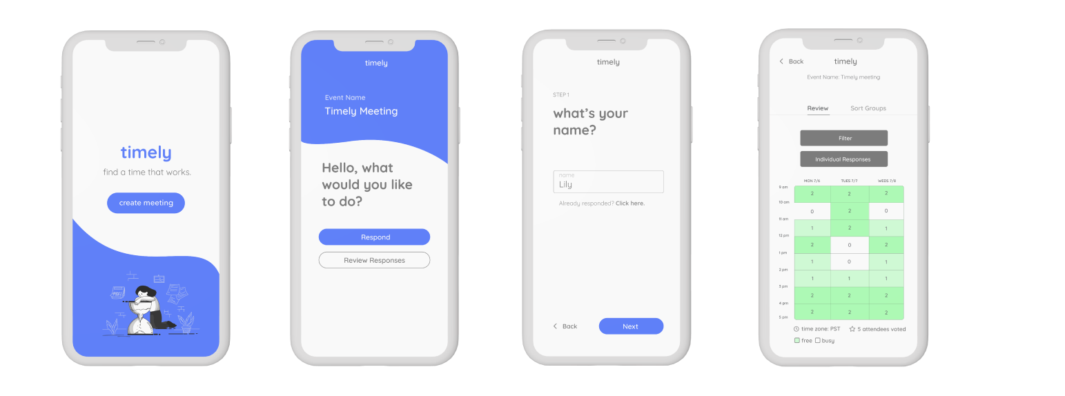
Why we built Timely
To fully satisfy the client and future users, we dove into background research to clarify who we were designing for and how to untangle the complexity of existing scheduling tools, not just ship another calendar grid.
Before drawing a single screen, we outlined the case: what we were looking for, how people already think about scheduling (mental models from tools like Doodle, Omnipointment, and When2Meet), and crucially what those products still fail to deliver. We needed clear answers to who, what, how, and why.
The outcome is a platform that stays UI-friendly and reachable with a tap, arrange meetings on the go, send invitations, and see schedules in one place on your phone.
Framing the problem and the people
To identify a solution, we had to define the problem and map demographics. Who would actually use this application, and why build it when so many schedulers already exist?
Lead / organizer
Needs to see everyone’s schedules to surface the best potential meeting times across a team.
Student context
Has to reconcile class schedules and work blocks, the product was aimed first at UC Santa Cruz labs and student teams.
Scale
Must support filtering and scanning both large cohorts and tiny project groups without losing clarity.
What Omnipointment and When2Meet got wrong
We audited the tools our audience already relied on. The pattern was clear: workable mechanics, weak experience, unclear flows, weak privacy, and schedules that don’t persist the way users expect.
The one-page alignment artifact
We condensed objectives, audience, tone, and positioning so every wireframe round stayed tied back to the same story.
Objective
Create a platform for people to start meetings smoothly, for events, work sessions, and everything in between.
Target audience
UC Santa Cruz undergraduate and graduate students, age ~18–30. Especially team leads coordinating lab and research meetings with members who juggle class, research, and outside commitments.
Insight
Leads and students lose time finding a slot that works for everyone, which delays work and adds coordination debt.
Single-minded thought
Timely is a tool dedicated to effortless meetings with coworkers and teammates, fast to set up, easy to trust.
Product background
Timely lets a user schedule with their team while surfacing class-based availability. People mark when they aren’t free instead of retyping entire calendars. The goal is fast, low-conflict meetings without playing email tag.
Competition & tone
Benchmarks: Doodle, Omnipointment, When2Meet.
Tone pillars we leaned into: efficiency, convenience, productivity.
Wireframes → low fidelity → high fidelity
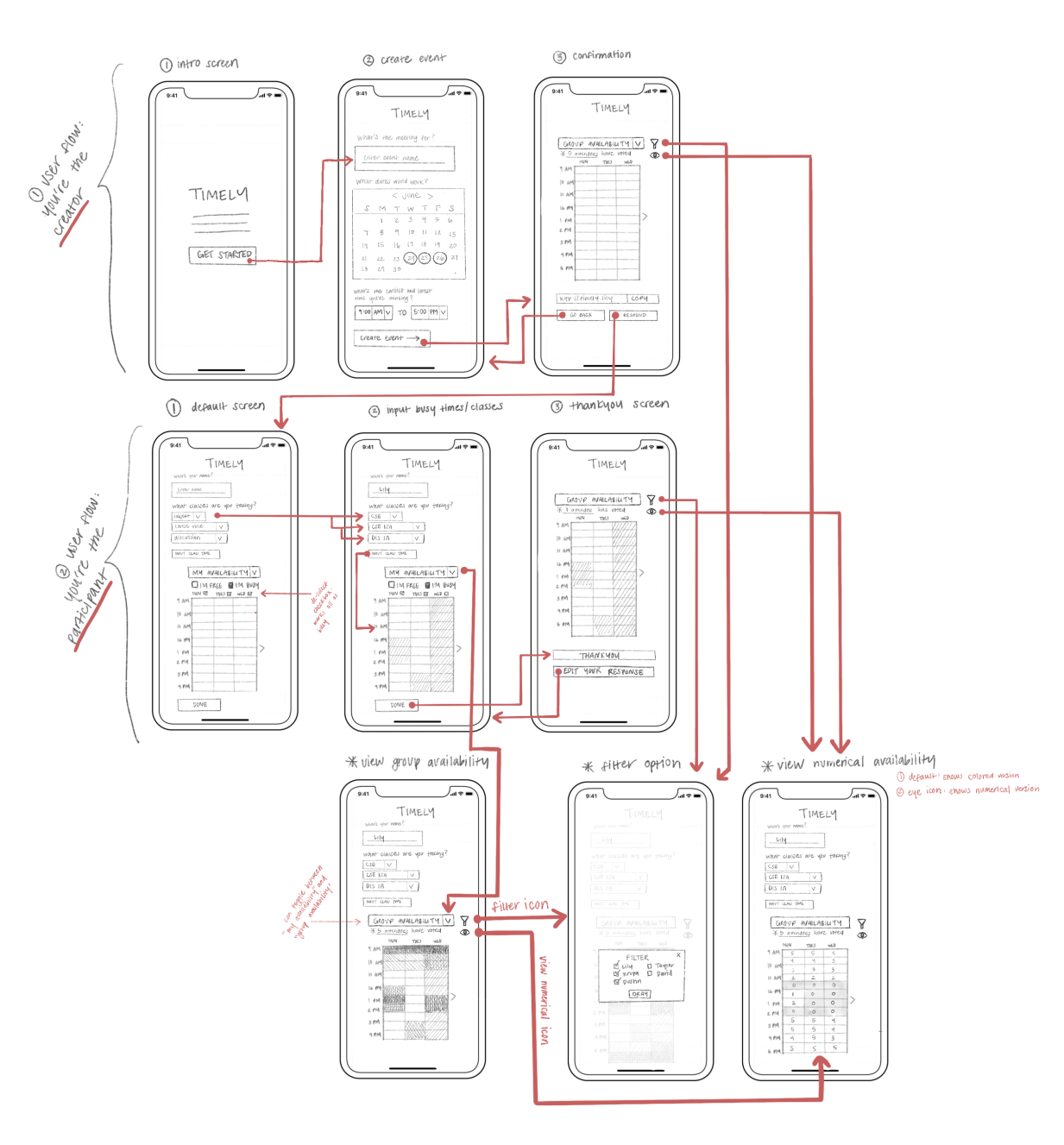
We moved from greybox exploration into a final low-fi pass that introduced color and hierarchy, then refined into hi-fi screens. Three milestones from the board: iterate on the participant journey, evolve the numerical view, and harden the filter pattern.
Iteration note · Participant flow
Expand the participant flow and break schedule input into individual steps; add a toggle-oriented review path so users aren’t dumped into one dense form.
Iteration note · Numerical view
Shift “Numerical view” toward per-person schedules so organizers can scan individuals without extra messaging overhead.
Iteration note · Filter
Filter opens a focused surface to compare people’s responses against the classes they’re taking, clearer separation between “people” and “availability types.”
Mapping the end-to-end journey
Before committing to high-fidelity, we mapped every touch point: how an organizer kicks off a meeting, how participants receive and fill in their availability, and how both sides converge on a confirmed time, no back-and-forth required.
Color, type, and voice
The deck locked a bright, academic-friendly palette and Quicksand for UI type, friendly geometry without feeling childish.
Typography
Quicksand, Timely
abcdefghijklmnopqrstuvwxyz 123456789!@#$%^&*()
Sample marketing line from the brief: Timely helps students organize fast meetings without fighting tiny availability windows or conflicting time slots, starting with what the meeting is for and which date ranges could work.
The final solution
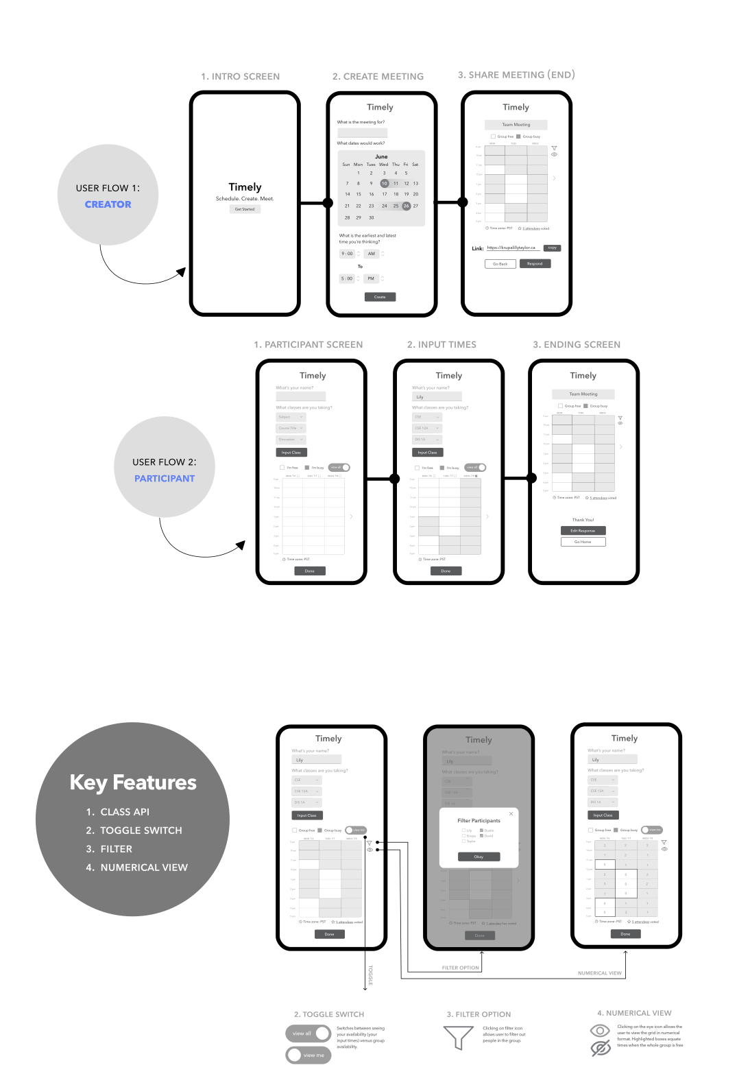
Two flows, one shared truth. The organizer sets the frame, participants mark only their constraints, and the whole group converges on the right time, no email chains, no calendar imports, no back-and-forth.
The lead kicks off the meeting window
The organizer names the event, picks candidate date ranges, and sends a single link, no calendar import, no sign-up wall. Just a frame and a window for availability.
As responses land, the group calendar populates in real time. The lead picks the slot with the most overlap, no back-and-forth required.
Mark your constraints, see everyone's
After tapping the link, participants mark only the times they can't make, no full calendar import, no rekeying every commitment. Only the organizer sees individual schedules; everyone else sees only the group heatmap.
Once their grid is submitted, participants can browse the shared calendar and see exactly which slots work for the whole group.
Isolate, toggle, and read the room
Filter individual responses next to the group heatmap so the lead can read each person's availability without switching context. Flip between personal and group views in a single gesture, no parallel tabs, no mental overhead.
The numerical view overlays per-slot counts with gentle density shading so “8 of 10 free at 2 pm” is obvious at a glance, no guesswork, no spreadsheet.
If time didn't exist…
Timely was a summer sprint proving that disciplined research, blunt competitive critique, and tight iteration loops could yield a mobile scheduler that respects both organizers and participants. The foundation sets up v2: desktop parity, smarter reminders after confirmation, and richer sorting when availability gets noisy.