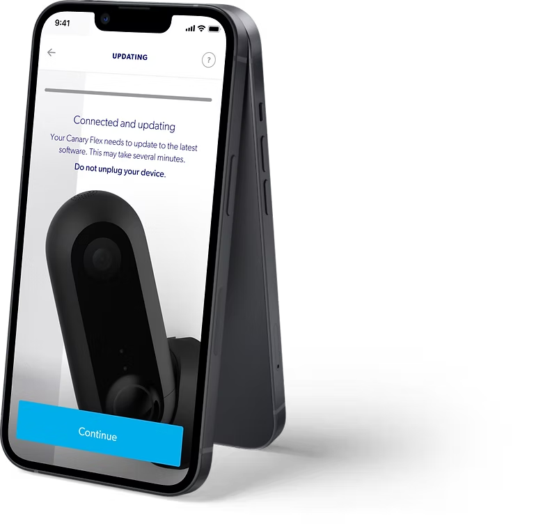
 Design System
One system to unite product and marketing
A comprehensive design system built from scratch, tokens, components, documentation, and contribution workflows adopted across 4 product teams at Smartfrog & Canary.
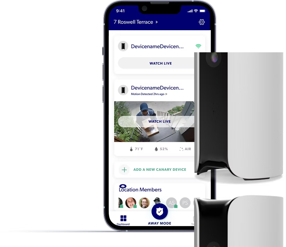
Two design languages living in one product
Canary's design was split across two siloed worlds: the Marketing team had its own visual language, and the mobile App team had a separate one. Icons, CTA buttons, and color palettes were inconsistent across surfaces, creating a fragmented experience for users and slowing down both teams.
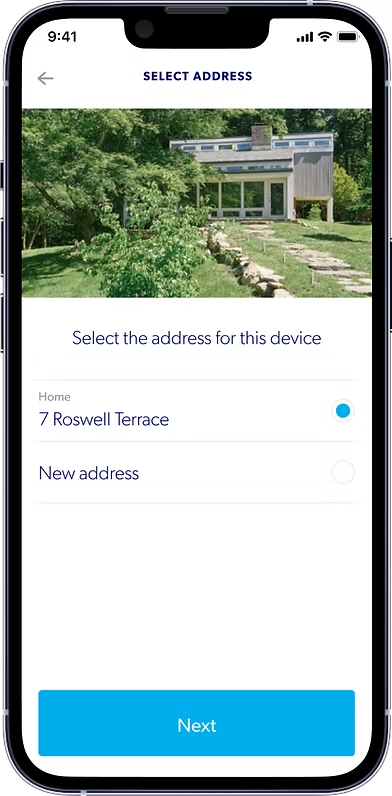
Understanding how small decisions shape perception
I led cross-functional research into three focus areas: iconography best practices, CTA button accessibility, and color psychology. The goal was to build a rigorous foundation for design decisions rather than making subjective calls on style.
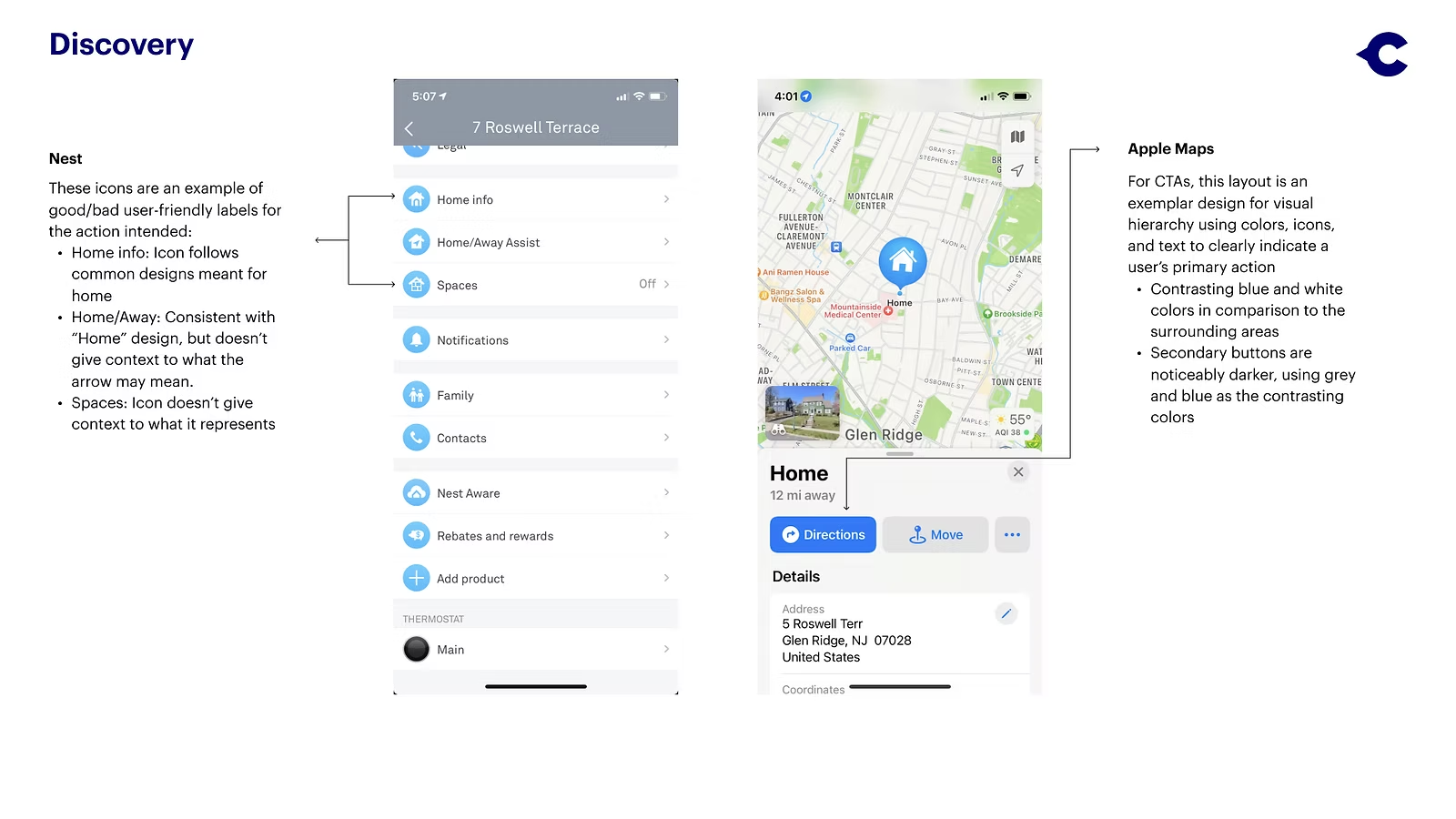
Iconography
Icons should reduce cognitive load, users need to identify the action in under 5 seconds with no context clues. We classified icons by primary, secondary, and tertiary action importance.
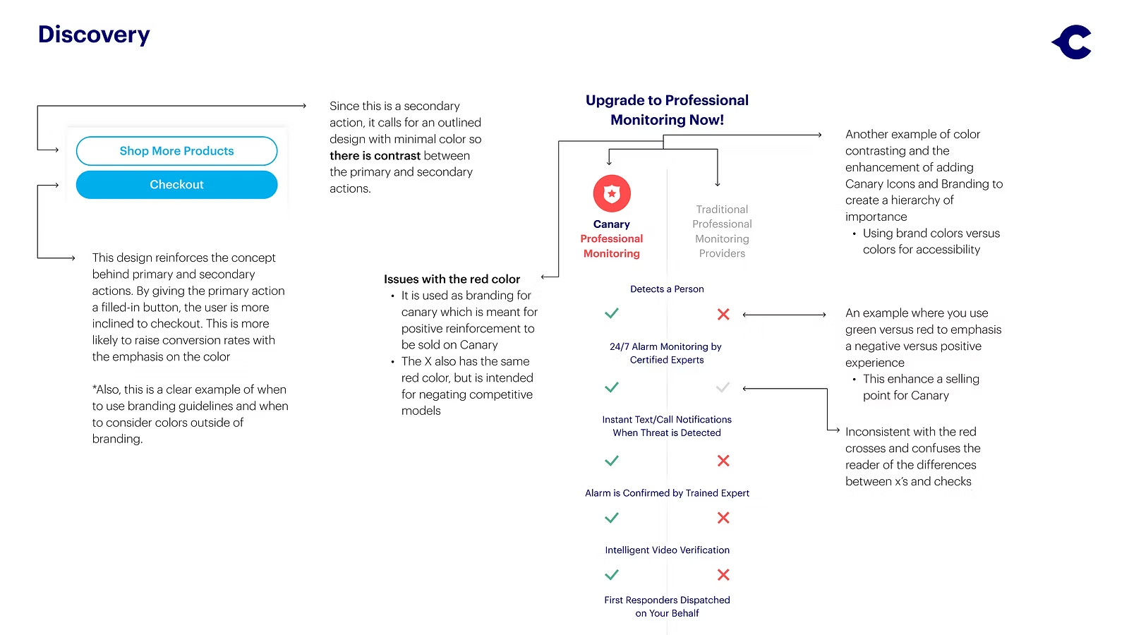
CTA Accessibility
Button colors must communicate the environment a user is entering. Contrast between CTA and surrounding space is essential for hierarchy, and designs need to account for all forms of color vision.
Color Psychology
Warm tones communicate energy and optimism; cool tones communicate safety and calm, directly relevant for a home security brand.
Auditing first, building second
Before designing anything new, I audited every existing component across both the app and marketing surfaces, cataloguing every inconsistency. From there, I mapped which elements needed to converge and which could remain platform-specific.
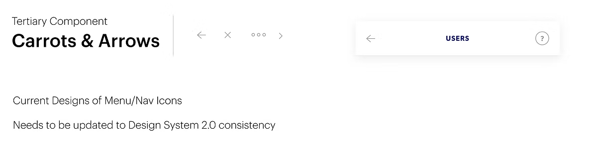
Current Navigational Elements
Menu navigation maintains increased readability. Menu Content chevron (opacity is changed from 40% to 20%) is readable and doesn't compete with header navigation.
Takeaway: Visual hierarchy is clear… less cognitive load.
A unified token system with two roles
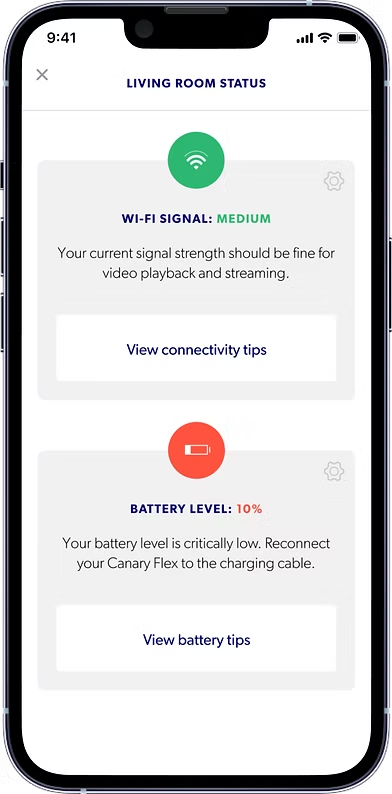
The final system introduced a shared color foundation while preserving intentional platform differentiation. Each color had a defined role, nothing was decorative.
System Green
Status & confirmation
#2DB872
Brand Navy
Primary brand
#000070
Action Blue
Primary CTAs
#1598E5
Alert Red
Warnings & errors
#FF533F
Caution Yellow
Caution states
#FFCE33
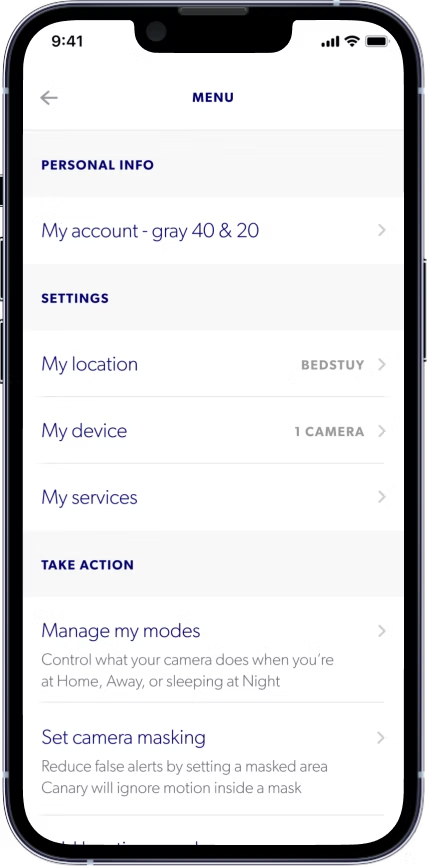
Redesigned Elements
Menu navigation maintains increased readability
Menu Content chevron (opacity is changed from 40% to 20%) is readable and doesn't compete with header navigation
Takeaway: Visual hierarchy is clear which gives less cognitive load.
Presented to leadership, shipped to engineers
The new system was presented to Senior Product Managers and executives, then handed off via updated app maps to the engineering team. Changes shipped in the next phase of the mobile application, reducing visibility issues and moving Canary toward a seamless, consistent brand identity.